Gourmet chic: Groceries go vogue
Editor’s note: Grocery shopping never felt this good before. In a content-driven world where aesthetics reign supreme, even something as mundane as shopping at the supermarket is being reconstructed into a multisensory experience.
Journalist Takshi Mehta takes a look at supermarkets across India that have redefined the shopping experience, bringing not just the supplies but also the vibes—the art, the architecture, the decor, the interiors, the arrangements. Take a look at these six Indian grocery stores with exquisite design philosophies that welcome you with warmth, character, and just a little bit of panache.
Written by: Takshi Mehta
*****
We live in a time where the mundane isn’t just lived, it’s staged. Every errand is content. Every pause is a potential post. Nothing is too ordinary to be captured, curated, and circulated.
An auto ride, a home-cooked meal, petting your dog, a quick supermarket run. All fair game. All sold as “authentic”. But only if the dog sits on a creme carpet, the meal lands on ceramic, the Rs. 50 auto ride is paired with a thousand bucks fit, and the grocery aisle is heavy on berries, avocados, and colour theory.
In this economy of aesthetics, even buying groceries has a moodboard. So here are six supermarkets that don’t just stock food, they deliver vibes, an experience, and a few decent shots for your next carousel dump.
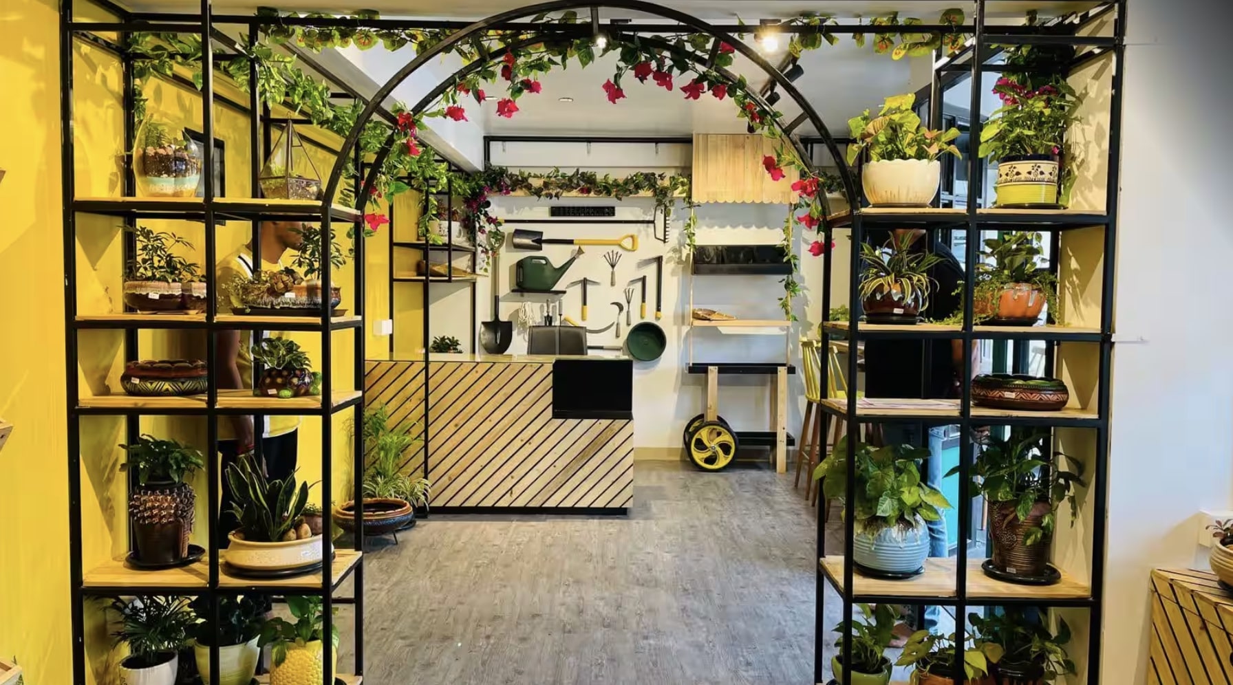
Cultivo is a compact, design-forward grocery store that prioritises layout and display as much as product. The space uses neutral walls, warm wood shelving, and focused lighting to keep attention on the produce rather than visual clutter. Shelves are low and evenly spaced, creating clear sightlines and an unhurried browsing flow. The inventory leans heavily towards organic vegetables, cold-pressed oils, grains, and small-batch pantry items, displayed in limited quantities instead of bulk stacks. Labels face forward, colour palettes are controlled, and packaging does a lot of the visual work.
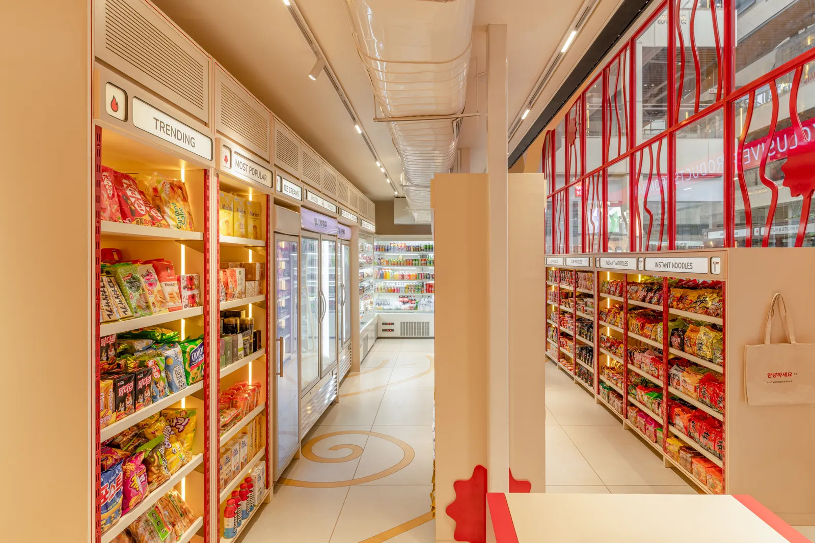
Ichiba is a Japanese specialty grocery in Gurugram that sticks closely to form and function. The name means ‘marketplace’ and the layout alludes to the same. It has tall shelving and clearly segmented aisles that mirror convenience stores in Japan. Product density is high but organised: imported snacks, instant noodles, sauces, frozen items, and ready-to-eat meals arranged by category, not aesthetics. Signage is minimal, packaging does the talking, and the colour comes almost entirely from labels rather than interiors, with a clear nod to the shades associated with the region. Refrigerated sections line the walls, checkout is compact, and nothing encourages lingering. Ichiba is designed for efficiency and specificity. You come here for Japanese groceries, not exploration, and the space is honest about that.
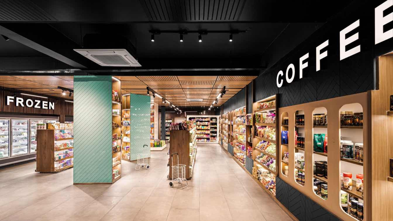
Ardaas Supermarket, Himachal Pradesh
Ardaas fits into this visual economy in a different way. Its appeal lies in density and excess rather than polish. Tall metal racks, narrow aisles, bulk stacking, bright utilitarian lighting. Everything is visible, nothing is styled out of frame. Regional staples sit beside national brands, cartons pile up, shelves stretch high, creating a cluttered, almost overwhelming visual field that photographs as abundance. Categories blur because consumption here is practical, not curated, and that messiness becomes the aesthetic. Ardaas doesn’t manufacture vibes, it accumulates them. In a culture obsessed with minimalism and restraint, its visual language is maximal, busy, and unintentionally striking, proof that even function-heavy retail can slip neatly into the scroll.
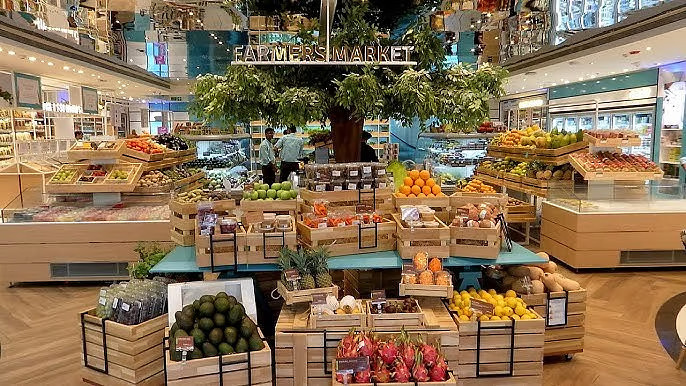
Food Square leans fully into the idea of the supermarket as a spectacle. Large-format, brightly lit, and tightly zoned, the space is organised to guide movement: fresh produce at the front, long central aisles for packaged goods, perimeter refrigeration for dairy and frozen foods. The colour palette comes from volume; stacked fruit crates, imported snacks, neatly faced shelves—rather than decor. Signage is bold and legible, built for quick scanning and quicker decisions. There’s a visible emphasis on global products and premium categories, which shapes both the inventory and the visuals. Food Square understands scale. It looks good because it has a lot, and because that “a lot” is controlled, aligned, and constantly replenished.
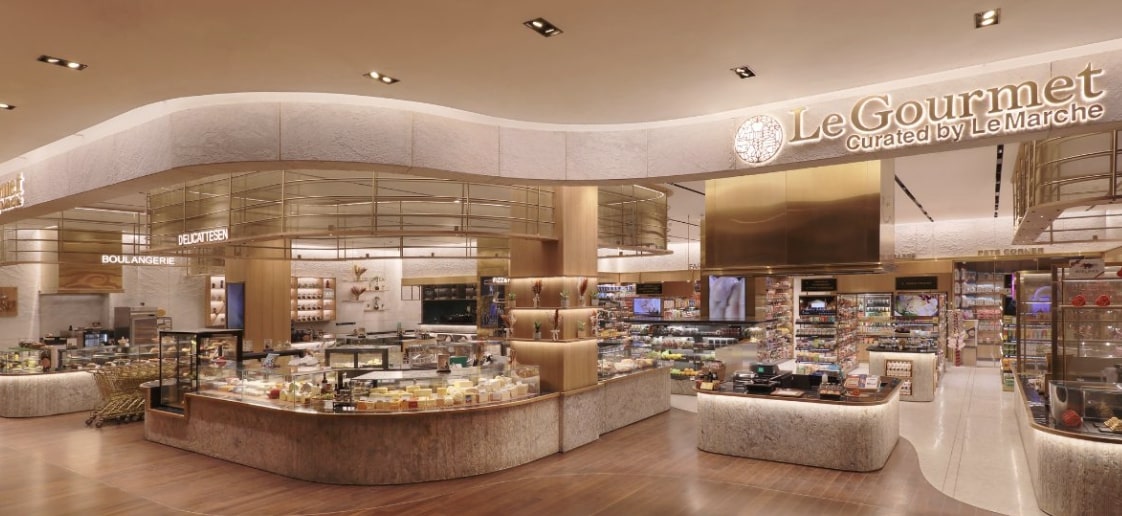
Le Gourmet is a study in precision and premium retail. Every aisle, shelf, and display is meticulously curated: imported cheeses arranged by type, wines by region, olive oils in uniform bottles, and artisanal breads stacked just so. Lighting is soft but directional, highlighting textures and labels, while dark wood shelving and marble countertops give the space a deliberate, high-end feel. Products are displayed in restrained quantities, letting each item claim attention. It’s a supermarket built around aspiration as much as necessity, the kind of place where photography and shopping overlap, where the “lifestyle” is embedded in the design as much as the inventory.
The Urban Platter Store, Mumbai
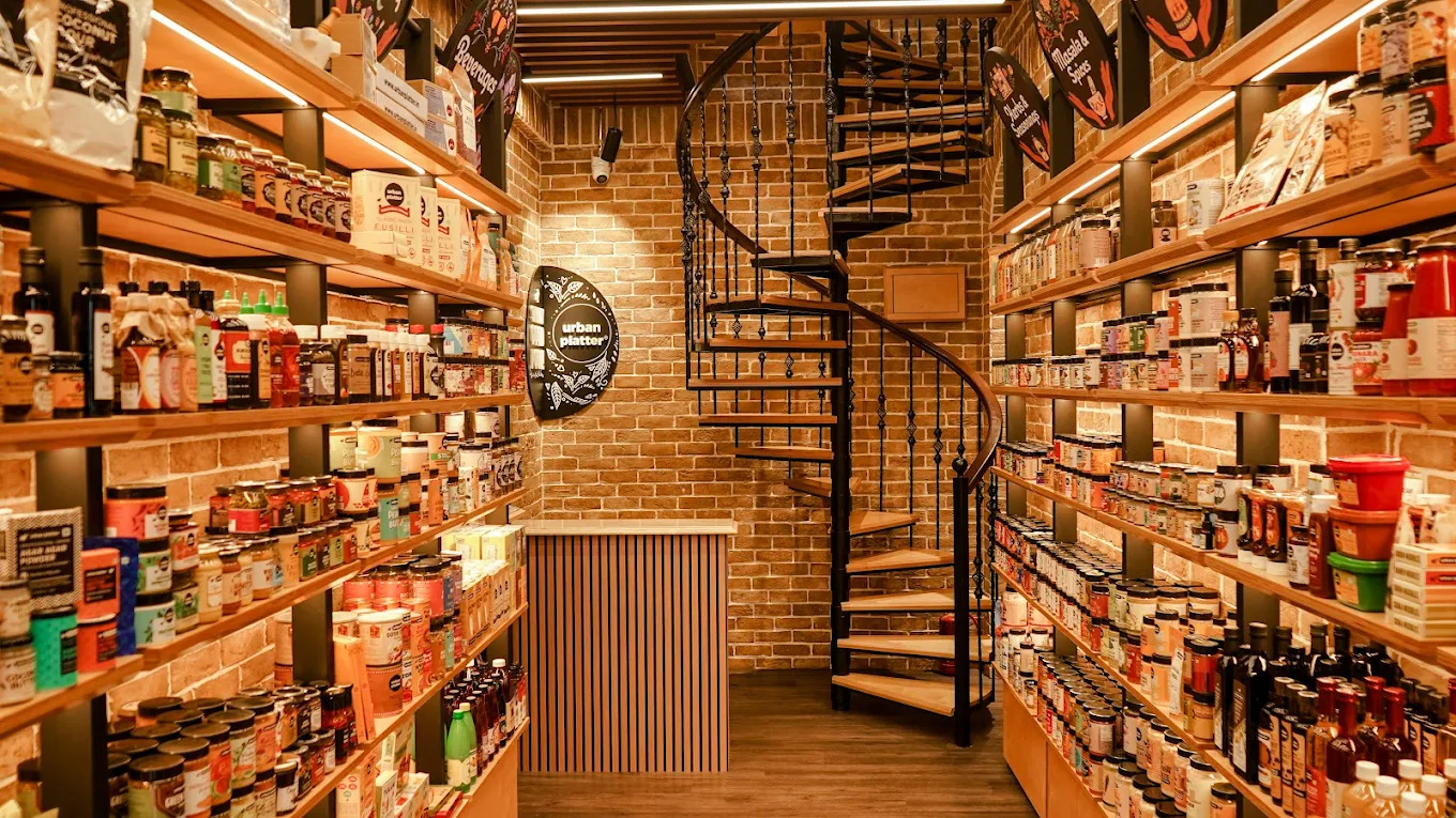
The Urban Platter Store is a laboratory of curated convenience. Shelves are low, wide, and uniformly spaced, making everything visible at a glance, while overhead lighting is bright and neutral, keeping the focus on the products. Specialty ingredients, international pantry staples, packaged snacks, and artisanal condiments dominate the inventory, each category clearly segmented with minimal signage. Packaging provides the visual drama—colourful jars, clean labels, and uniform boxes. The store balances abundance with order: plenty to explore, but nothing feels chaotic. It’s designed for discovery, for the scroll as much as the shopping list, and every aisle doubles as a photo-ready tableau.
*****
Takshi Mehta is a lifestyle writer and journalist with an enduring love for cricket, cinema, and culture. You can follow her on Instagram: @takshimehta


 souk picks