A love affair with restaurant menus
Editor’s Note: Every month we bring to you an article from our partner enthucutlet—a truly unique food magazine that brings you unusual stories, perspectives, and guides on food in India and beyond. The magazine is helmed by a brilliant team of editors and the good folks of Hunger Inc—the parent company of The Bombay Canteen, O Pedro, Bombay Sweet Shop and Veronica’s. This month we curate an essay on what makes a good menu—context, design, care—and to some degree obsession. We strongly encourage you to check out the rest of their content on their website.
Written by: Anurag Arora is a designer and a cook—the intersection of his dual virtuosities leads to an obsession with the way menus look and read.
Back in 2015, in Chicago, I went to this restaurant called Lula café.
At first it looked like a simple and unassuming brunch restaurant, but the fanfare around it and its many glowing reviews on Yelp had piqued my curiosity.
As a self-proclaimed brunch enthusiast, it was an easy decision to give it a try. I sat down and saw my first ever rotating daily menu. It was printed on what I would remember as a 200 gsm matte grey paper. It had the restaurant logo, a date stamp which I thought was a nice touch, and a total of 14 dishes on the menu. Just 14? I know it sounds normal now, but back in 2015, and for someone who didn’t travel much at the time, this was completely new. I then started reading the menu. Each dish was named matter-of-factly (like ‘French Toast’), but the line following it—the description of its ingredients—truly captivated me.
One particular dish caught my attention immediately. It read: custard toast, cookie crumble, and burnt coffee caramel. I felt a surge of excitement and curiosity about what might show up at the table. I glanced through the description of each dish and noticed a consistent style—highlighting its ingredients and letting the diner connect the dots.
Another one read ‘Benedict’ and once more, its description took the cake: toasted day-old donut, poached egg, dill hollandaise. The beauty of it all overwhelmed me. I looked at the menu again, and discerned the mood they were building with it. Their choice of paper was very considered, the typefaces used in the headings were elegant serif fonts, resulting in a finish that was both refined and minimal.
This aesthetic also matched the plating which was in turn beautiful and intricate. It all started falling into place for me. Of course, I enjoyed my meal. That particular brunch persists as one of my most cherished meals—not just for the food, but for the overall experience, which started with the crafting of the menu. As the meal approached its end, I couldn’t resist asking my server if I could keep that beautiful piece of paper.
That was the first menu I collected.
After that meal, I have consciously or subconsciously paid attention to hundreds if not thousands of restaurant menu designs across India and several other countries. It is clear that exceptional menus are always crafted, and never just a happy accident.

Menus by themselves are very complex. Should the list include an abundance of dishes, or should it stick to a select few stars? Should restaurants add lengthy descriptions, or should they mention ingredients to tease the diner? Should menus be printed on plain paper or on something more refined? Should they be bound as a booklet, or kept in an open layout? Should photographs be included or not?
How the dish is detailed carries immense weight.
Its description has the power to elevate a banal-sounding choice into one that elicits a spontaneous burst of excitement and anticipation. You can call an item ‘Pork Chops’ and leave it as is on the menu, but a few additional words can work like magic. Consider: ‘Bahar’s Applewood Smoked Pork Chops’. The added descriptors transform something known into a fascinating choice rather quickly.
Context is simply what you are trying to sell, where you are located, and who your customers are, amongst other things. But the mood is where it gets fascinating. It’s the bit where a restaurateur or chef needs to make a conscious, intentional choice. Do they want to elicit a sense of fun, approachability, elitism, or perhaps even astonishment?
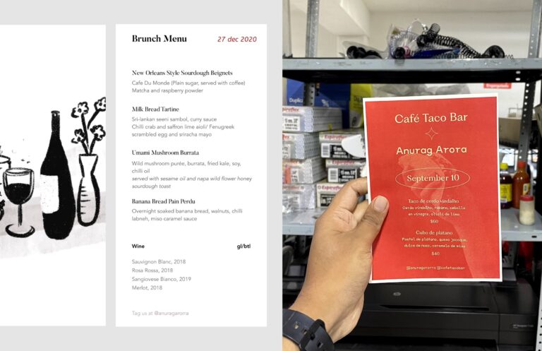
To illustrate: when I dream about executing menus, there are two that I keep coming back to as an exercise. The first one is a brunch menu designed to transport diners to an exclusive setting. The second, a menu for a lively taco popup, where the emphasis is on having a fun-filled night without a care about boozy overindulgence.

But for now, let’s consider a street vendor selling vada pav. This local favourite in Mumbai has a dedicated clientele that seeks affordability and approachability. For a seller of vada pav, a straightforward factual menu displayed on a board with prices suffices perfectly. It aligns with both the context of the meal, and their intended purpose.
Conversely, an upscale restaurant catering not only to locals but also to international visitors, which includes vada pav on their menu may want to make it a lot more descriptive to ensure clarity for their audience.
Let’s stress test this framework further. Let’s consider the example of a restaurateur who is launching a pizza bar. They want the place to pulsate with local energy and a menu that is ingredient forward. But most importantly, they want to keep it super fun and casual. So, what is a good way to plan the menu for this pizza bar? The menu design will be led by the keywords casual, approachable, local, super fun. One way to design it is to embrace colour, and print a vibrant menu on eye-catching flyers. The names of the pies will also contribute to an overall sense of enjoyment. It will also help to keep the menu small and easy to pick from.
I’m a cook (and a designer) myself, so I’m always thinking about menu design. What makes a good menu? It’s care, consideration, and to some degree, obsession.
Grab a bite of enthucutlet
enthucutlet is a bimonthly food mag that brings you unusual stories about food in India (& sometimes beyond). Check out all our original food stories (like Gary Mehigan’s Mega Festival Diet) and actionable guides (like Chef Niyati Rao’s Nagaland 101) on our website.
Our ongoing season is 'Festivals + Feasts'. Through this month, expect original stories, delicious tips and pointers, and lively events, all of which will explore how our festivals are all really about food.
To get first dibs on all things enthu, and to connect with fellow cutlets, subscribe on our website, and follow us on @enthucutletmag on Instagram, Twitter, and Threads.
enthucutlet is brought to you by the cutlets behind The Bombay Canteen, O Pedro, Bombay Sweet Shop, and Veronica's.


 souk picks